If your dashboard shows visitors bailing after a few seconds, you’re not alone. “Time on site” (or, in GA4 terms, Average engagement time per session) is a sensitive signal: it rises when your page matches intent and is easy to use, and it collapses when something—anything—feels off. Here’s how to diagnose the drop-offs and lift engagement without chasing vanity metrics.
First, measure the right thing
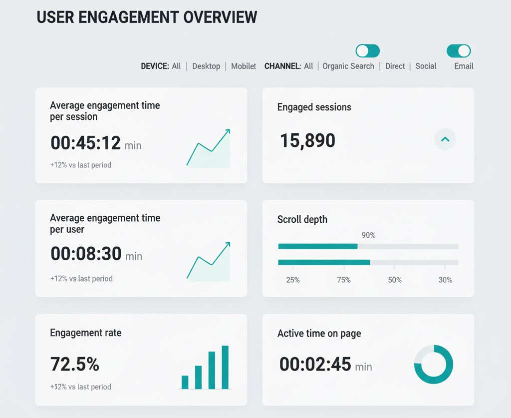
In GA4, stop fixating on classic “average session duration.” Prioritize:
- Average engagement time per session and per user
- Engagement rate and engaged sessions (10+ seconds, 2+ page views, or a conversion)
- Scroll depth (25/50/75/100%) and active time on page (custom event)
- Segmented views by device, channel, landing page, and content type
Time alone can mislead. A support article that answers a question in 20 seconds is a success; a product page that earns 20 seconds and zero adds-to-cart isn’t.
Why visitors bounce fast (and what to do)
1) Mismatch between promise and page
Symptom: Traffic arrives from a keyword/ad that promises X; your hero or first paragraph talks about Y.
Fix: Mirror the search intent and the ad copy in the first 200–300 pixels: reiterate the query/problem, show the answer or path, and make the primary action obvious. Align title tags, H1, and hero copy with the “job to be done.”
2) Slow, jittery, or cramped pages
Symptom: High abandonment on mobile, especially on first visit.
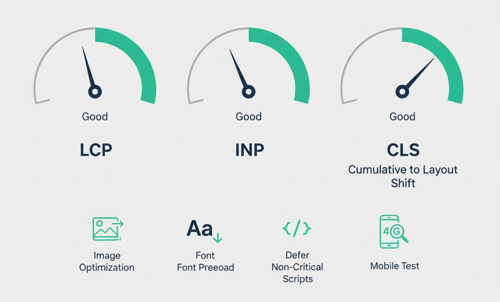
Fix: Improve Core Web Vitals—LCP (faster first render), INP (snappier interactions), CLS (no layout jumps). Use lighter images, defer noncritical scripts, preload fonts, and kill render-blocking CSS/JS. Test on a mid-range Android over 4G, not your dev Mac on fiber.
3) Cognitive overload above the fold
Symptom: Users scroll a bit and leave; heatmaps show scattered clicking.
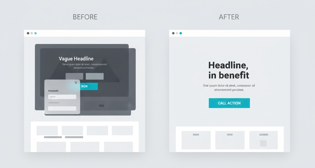
Fix: Simplify the first screen. One headline, one sentence of context, one primary CTA. Use a scannable hierarchy (H2s, bullets, preview boxes). Add a TL;DR for long reads and a table of contents that sticks.
4) Weak information scent and dead ends
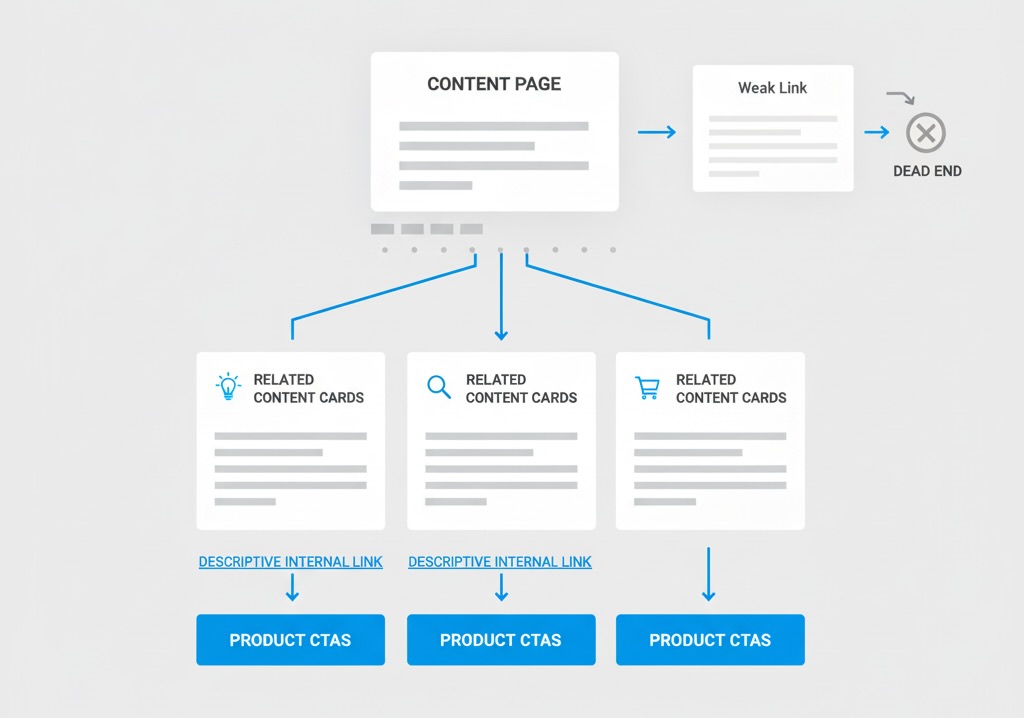
Symptom: Single-page sessions dominate content hubs (see our blog traffic guide).
Fix: Curate next best actions: related articles by intent stage, product CTAs mapped to content topics, and persistent breadcrumbs. Use descriptive internal links (“Compare pricing tiers”) not vague “Learn more.”
5) Interruptions and trust breakers
Symptom: Pop-ups, cookie walls, and auto-play video spike early exits.
Fix: Delay promos until 30–45 seconds or 50% scroll, cap frequency, and keep content visible. Replace auto-play with a static poster + play button. Make your consent banner compact and non-blocking.
6) Thin content (or the right content in the wrong format)
Symptom: Time is low on how-to content that should engage.
Fix: Convert walls of text into steps, checklists, and visuals. For product education, add an explainer GIF or a 30–60s demo. For comparisons, use a compact table and an opinionated “best for” verdict.
7) Navigation friction
Symptom: Users pogo-stick: SERP → your page → back to SERP.
Fix: Answer the core question immediately with a summary, then expand. Add FAQ schema where appropriate to win rich results that match the page content, not just the keyword.
8) Analytics blind spots (it’s not them, it’s your tracking)
Symptom: “Zero time” pages or suspiciously short averages across certain templates.
Fix: Fire engagement events on visibility and real activity (scroll, copy, play, expand). Ensure SPA route changes trigger page_view events. Filter bots and exclude internal traffic.
How to diagnose quickly
- Break down by landing page (top 20) and by device. Time problems are often page-template problems.
- Overlay acquisition: some channels (e.g., Paid Social) bring skimmable traffic. Adjust expectations and CTAs for those visitors.
- Watch 10 session replays per weak landing page. Look for rage clicks, pauses, and where attention dies.
- 5-second test: show your hero to a neutral person for five seconds; ask “What is this? What can I do here?” If they can’t answer, refactor the fold.
- Correlate with Core Web Vitals: low time + poor LCP/INP/CLS = technical debt, not content.
Make time meaningful, not just longer
The goal isn’t to trap people—it’s to help them accomplish a task. Tie engagement to progress.
- Map intent to depth:
- Problem discovery → summary + visuals + soft CTA (read next).
- Solution evaluation → comparison table + proof (case snippets, logos) + primary CTA.
- Decision → pricing clarity, frictionless trial, trust badges, short forms.
- Instrument outcomes, not only minutes: add-to-cart, video complete, doc downloads, calculator use, and micro-conversions (e.g., “viewed pricing for 10+ seconds”).
- Personalize the fold by entry context: if
utm_source=linkedinon mobile, lead with social proof + quick demo; if email from onboarding flow, show the next activation step.
Content and UX upgrades that move the needle
- Compress the first 10 seconds: a benefit headline, one line of clarity, and a single, strong CTA.
- Progressive disclosure: hide secondary details behind accordions; reveal context as users signal interest.
- Readable typography: 16–18px body text minimum, 1.5–1.7 line height, 60–75 character line length.
- Visual anchors every ~300 words: images, quotes, mini diagrams—each with a clear purpose.
- Inline summaries: at the end of key sections, add a one-sentence takeaway and a relevant next click.
When a short visit is actually a win
Not every page should maximize time. A login page, pricing confirmation, store locator, or a “copy code” promo should be fast. For these, success = task completion with minimal friction. Define page-level KPIs so your team doesn’t “improve” time by making quick tasks slower.
Bottom line
People leave quickly when the page doesn’t match their intent, wastes their time, or feels hard to use—especially on mobile. Fix the fold, speed, and information scent; instrument real progress, not just minutes; and your engagement time will climb for the right reasons: visitors are finding what they came for and moving forward.