If your website exists to do something—sell, capture leads, book demos, get subscribers—you already have a conversion funnel whether you planned it or not. A funnel is simply the series of steps people take from discovering you to completing your goal. Making that path visible helps you find where interest leaks out and what to fix first.
This mini-guide explains funnels in plain English, shows common shapes across site types, and gives you a quick table to diagnose problems without diving into heavy tooling.
The simplest definition
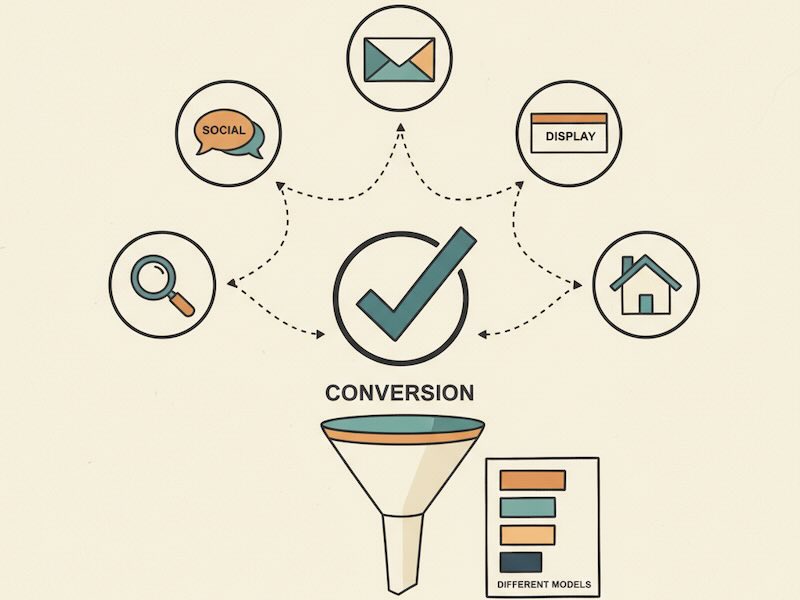
A conversion funnel is a step-by-step path from first touch to desired action.
Each step answers a question in the visitor’s head. When an answer is unclear, people drop off—that’s your “leak.”
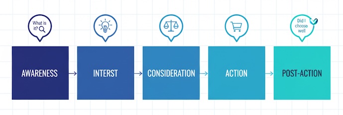
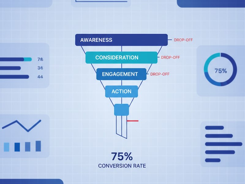
Typical high-level stages:
- Awareness — “Who are you?”
- Interest — “Is this relevant for me?”
- Consideration — “Can I trust you and is the offer clear?”
- Action — “I’m ready—what’s the next step?”
- Post-action — “Was it worth it? Should I return or refer?”
You can name stages differently (AARRR, AAARRR, ToFU/MoFU/BoFU). The point is the sequence, not the label.
Why funnels matter (even for a one-pager)
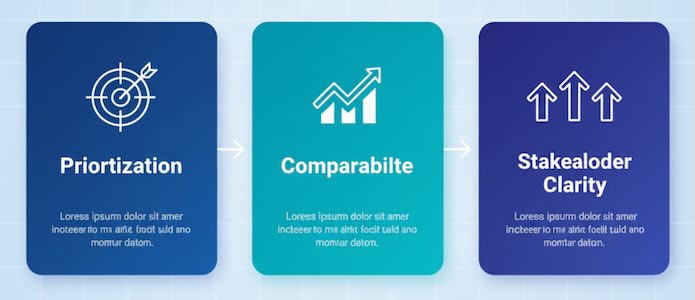
- Prioritization: You’ll know whether to fix the headline, the offer, or the form instead of guessing.
- Comparability: You can benchmark steps over time or across campaigns.
- Clarity for stakeholders: A simple, shared map replaces vague statements like “traffic is low quality.”
How funnels differ by business model
E-commerce:
Ad click → Product view → Add to cart → Checkout → Purchase
B2B/SaaS:
Content/Ad → Landing page → CTA click → Form start → Form submit → Demo/trial → SQL → Close
Content/Publisher:
Search/Social → Article view → Scroll/Engagement → Subscribe → Return visit
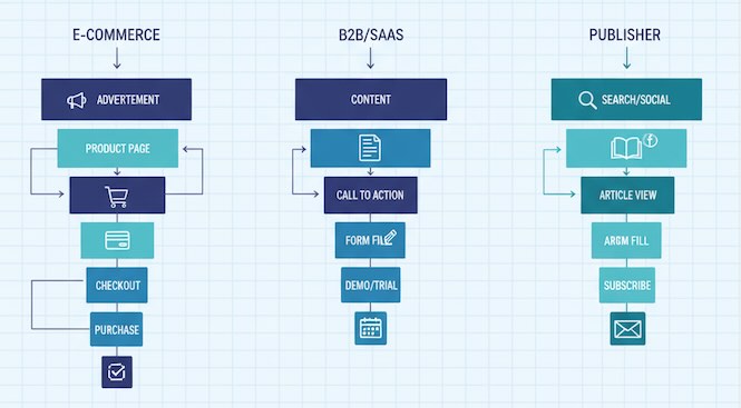
Same logic, different actions.
The funnel on a page: micro vs. macro actions
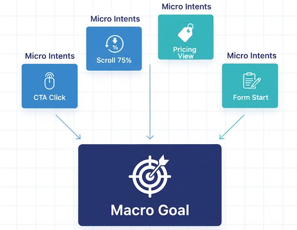
- Macro-conversion: the primary goal (purchase, submit lead, subscribe).
- Micro-conversions: signals of intent that precede the goal (CTA clicks, scroll depth, pricing tab open, form start).
Tracking a few micro steps gives early clues even when final conversions are scarce.
Quick diagnostic table (copy this into your doc)
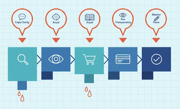
| Funnel Stage | Visitor’s Question | Typical Signals | Common Leaks | First, Try This |
|---|---|---|---|---|
| Awareness → Visit | Why should I care? | CTR from ads/search, new users | Irrelevant promise, mismatched keywords | Align ad/search copy to page headline; clarify audience in the first line |
| Landing → Interest | Is this for me? | Hero CTA clicks, time to first action | Vague value prop, buried CTA | Rewrite headline + subhead; make one primary CTA obvious above the fold |
| Interest → Consideration | Can I trust this? Is it clear? | Scroll 50–75%, pricing/FAQ clicks | Missing proof, confusing pricing | Add social proof near CTA; simplify plan comparison; show “what happens next” |
| Consideration → Action | What’s the risk? | Form starts, add-to-cart, checkout starts | Long forms, surprise fees, friction | Cut fields, show total cost early, explain privacy/guarantees inline |
| Action → Success | Did it work? | Form submits, purchases | Errors, unclear confirmation | Plain “success” page with next steps; offer receipt, onboarding cue |
| Post-action → Retention | Should I come back? | Repeat purchases, return visits | No follow-up, weak onboarding | Send helpful onboarding content, nudges, and value reminders |
Use it as a weekly stand-up artifact: highlight one leaking step, agree a single fix, then re-check.
Do you actually need a funnel?
Short answer: yes, unless your site is purely informational and has no meaningful action. Even then, you likely want email signups or return visits.
When a funnel is essential
- You spend money on ads or content and must prove ROI
- Sales/lead volume fluctuates and you need to isolate why
- You’re planning a redesign and want evidence-based priorities
When a lightweight funnel is enough
- A single landing page with one CTA
- Early-stage projects validating offer/market fit
- Small blogs tracking subscriptions rather than sales
When a formal funnel might be overkill
- One-off campaign pages with tiny spend and short life
- Hobby sites with no goal beyond casual reading
Even in “overkill” cases, a 3-step sketch (visit → key interaction → goal) pays off.
Benchmarks (directional, not rules)
- Landing → CTA click: 25–60% when the first screen is clear and focused
- CTA click → Form start: 60–90% for short forms
- Form start → Submit: 50–80% with 3–5 fields
- Add to cart → Purchase: 20–40% depending on shipping, trust, and price

If your numbers are far below these, start with copy clarity and friction removal before changing traffic sources.
Common funnel myths—debunked
- “We just need more traffic.” If your leak is between form start and submit, extra traffic only wastes money.
- “Time on page is success.” Time is a clue, not a goal. Actions trump dwell time.
- “Every step must improve at once.” Fix the narrowest bottleneck first; the rest can wait.
- “Funnels are for big teams.” A notepad sketch and three metrics can outperform a dozen dashboards.
Story-driven examples
Example 1 — Lead gen page
High hero CTA clicks, low form submissions. Diagnosis: people like the promise but hate the form. Fix: remove optional fields, add a privacy note, state what happens after submit. Result: same traffic, more leads.
Example 2 — Store checkout
Healthy add-to-cart, drop at payment. Diagnosis: shipping surprise or weak trust. Fix: show total earlier, add badges/reviews, offer guest checkout. Result: fewer abandons without redesigning the whole site.
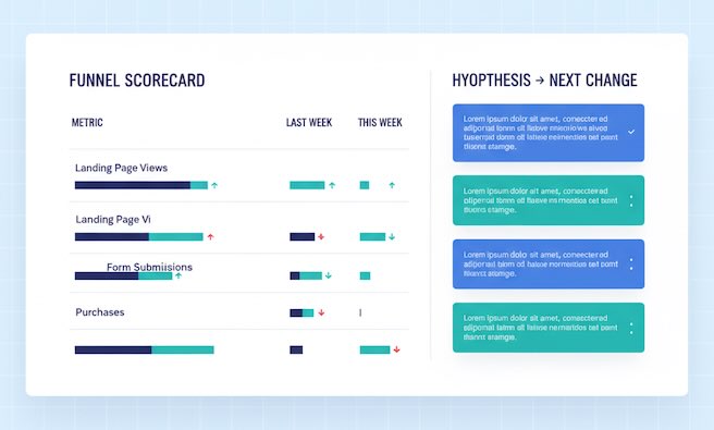
A one-page funnel scorecard (fill weekly)
| Step | Metric | Last Week | This Week | Trend | Hypothesis → Next Change |
|---|---|---|---|---|---|
| Visit → CTA click | % of sessions with hero click | 31% | 27% | ↓ | Headline unclear for new audience → test “problem + promise” framing |
| CTA click → Form start | % of clickers who focus first field | 72% | 74% | ↑ | Keep; consider moving form higher on mobile |
| Form start → Submit | Completion rate | 52% | 61% | ↑ | Fewer fields + privacy note worked; consider progress cue |
| Add to cart → Purchase | Checkout completion | 28% | 29% | → | Shipping cost preview still unclear; add cost estimator on PDP |
This keeps discussions concrete and forward-looking.
Quick FAQ
Is a funnel the same as a user journey?
A journey is broader (multiple sessions, channels). A funnel is a measurable subset focused on a specific goal.
How many steps should I track?
As few as explainable—usually 4 to 7. More steps = more noise, less action.
What if visitors skip steps (e.g., buy from the first screen)?
Great! Your funnel should allow fast paths. Don’t force linearity—observe reality.
The takeaway
A conversion funnel isn’t a fancy dashboard. It’s a simple story: who arrived, where interest rose or fell, and what made action easy or hard. Map that story in a handful of steps, watch the transitions, and fix one leak at a time. Whether you’re running a store, a SaaS trial page, or a personal blog, this clarity turns random tweaks into compounding wins.
